Over the last few years I have found myself reaching for CSS Flexbox with increasing frequency. Once you get a handle on a few basic properties it makes it very easy to position elements in a way that is natural and responsive. But it often seemed a bit magical to me. In particular, my deepest wonderings related to how the size of the individual flex items were determined by the browser. Unsurprisingly, there is some basic logic underpinning this process, and I will attempt to outline this logic here.
Please note, this post will not attempt to describe the various
properties that allow us to control the flexbox layout, e.g.
flex-flow,
justify-content or
align-items.
There are other fantastic articles that go through these properties in detail, such as
this
CSS Tricks article, or the always-exceptional MDN docs (as linked above).
Instead, my focus in this post will be to discuss and understand the
flex properties, and how this controls the elasticity of
individual flex-items.
Introduction to Flexbox
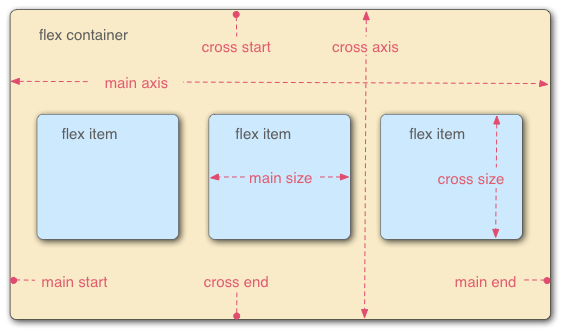
Flexbox is used to position elements in a one-dimensional layout. It is comprised of a container, which we call the flex-container. The direct child elements of this container are the flex-items.
Flexbox allows arrangement of the flex-items along the main axis, and
provides additional properties to control alignment of the items on
the cross-axis:

As a simple example we will consider the following markup, which comprises a single container element with three children:
    Item 1
    Item two
    Item three
With no flexbox styling applied, each of the childen will be block elements of 100% width.
If we apply the following styles we can convert the container into a flexbox with the main axis running across the horizontal:
  .flex-container {
    display: flex;
    flex-direction: row;
    justify-content: space-between;
  }
With these simple style rules we have given the browser enough information to layout the flex-items, equally spaced along the horizontal axis.
We have defined flex-direction: row;, but this is actually
the default direction, so this property is not required.
However, we can change the main axis to be vertical by simply setting
flex-direction: column;, and this would take us back to the
layout which we saw in example 1.
The justify-content property is all we need to tell the
browser how we want the flex-items to be arranged along the main axis
of the flex-container. Pretty cool, and pretty easy to achieve.
The flex-grow property of flex items
The flex-grow property controls how the flex-items should
expand, within the flex-container, to fill any remaining space available
to them. This property should be assigned a numeric value which defines the
weighted allocation of excess space to each of the flex-items.
If the value is not set, as was the case in example 2, then the
flex-items will not expand into the free space. This is equivalent
to setting flex-grow: 0.
If we want the flex-items to take up equal space along the main axis, we give them an equal value for flex-grow. Let's choose a value of 1, but in truth any value can be chosen so long as it is the same across each of the flex-items.
  .flex-container {
    display: flex;
    flex-direction: row;
  }
  .flex-item {
    flex-grow: 1;
  }
Perhaps we only want to allow the middle item to expand. We can achieve
that by setting flex-grow to zero for all the other items,
except for the one we wish to be expandable:
  .flex-container {
    display: flex;
  }
  .flex-item {
    flex-grow: 0;
  }
  #two {
    flex-grow: 1;
  }
So far so good, but what if one of the items has more content than
the others? In that case the picture above becomes a little more
complicated. Consider, once again, the case where all flex-items
have flex-grow: 1, but this time lets give item 3 a
little more content:
This case illustrates that flexbox is not splitting the full flex-container width equally between all items. Instead it is splitting the extra space equally. When the content is the same in all flex-items, these statements mean the same thing. But because the natural width of the third item is originally greater (owing to the extra content it contains), it ends up being wider than the other two items.
What if we want to give our flex items equal width, even when their
content length varies? This is where the flex-basis
property becomes useful.
The flex-basis property of flex items
The flex-basis property controls how the browser determines
the natural width of the flex-items.
Typically the values for this property will be set to an explicit width,
as a percentage or in absolute terms. Alternatively, one may use the
keyword auto, which is the default behaviour.
When you specify auto the browser will use the width
property of the element as the basis. In examples above this is
dictated by the width of the content, but if an explicit
width is set on the flex-item this will be used instead.
So to ensure our flex-items have an equal width across the main axis we
need to ensure that we give them an equal, fixed,
flex-basis value. In our case a value of zero should work
well. The flex-items will be presumed to have zero width, and the excess
space along the main axis (i.e. all the space) is split
according to the flex-grow proportions.
  .flex-container {
    display: flex;
  }
  .flex-item {
    flex-grow: 1;
    flex-basis: 0;
  }
If we specify a flex-basis for each item, we reserve an
inital space for the item and then we expand the items, from this base
size, into the space available. The following image from W3C illustrates
the idea perfectly, encapsulating the key message of this article.

At the top of the figure the flex-items have flex-basis: 0
so the horizontal space is split in a ratio that is consistent with the
flex-grow properties of the individual flex-items, i.e. a
ratio of 1:1:2 in this case.
In the lower part of the figure the flex-basis: auto means
that the individual flex-items have widths dictated by their content.
The excess horizontal space is then split out in the ratio 1:1:2.
Using these ideas lets give our first flex-item a
flex-basis of 100px, and see how this affects the
distribution of space between the items:
  .flex-container {
    display: flex;
  }
  .flex-item {
    flex-grow: 1;
    flex-basis: 0;
  }
  #one {
    flex-basis: 100px;
  }
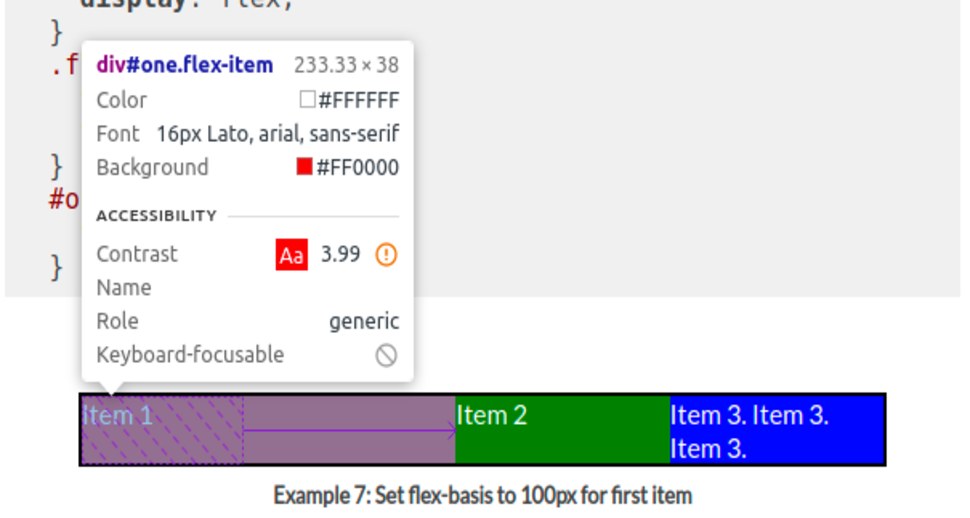
As you can see, the first flex item is granted the 100px width which we have allocated and it is also given a share of the excess space we have allocated.
If you inspect the element using your browser dev tools, you should see the elements flex behaviour is well illustrated. I am using DevTools in Chrome, and you can clearly see the reserved (basis) size for item one and the arrow illustrating how the element has grown from this base value to fill the available space. Items two and three have been granted the same growth, but from their basis of zero.

So with the flex-basis and flex-grow we can
stipulate the width or our flex-items and how they expand into the
available space. What happens when the flex-items don't fit along the
space available on the main axis? We can control what happens in these
cases using flex-shrink.
The flex-shrink property of flex items
The flex-shrink property controls how much we allow the
flex-items to contract in order to fit along the main axis.
You will need to ensure that the flex-wrap property on the
flex-container has been set to nowrap, otherwise your
items will wrap rather than exhibiting the contraction that we wish to
demonstrate here.
Forgive this daft example, but hopefully it will give you a feel for
the behaviour controlled by flex-shrink.
Let's assign the flex-items with flex-basis: 50%;,
defined in percentage terms this will be a percentage of the
flex-container width.
Of course these are clearly not going to fit, but let us also specify
the flex-shrink propery for these flex-items to be 0, 1
and 2, respectively:
  .flex-container {
    display: flex;
  }
  .flex-item {
    flex-basis: 50%;
    flex-grow: 1;
  }
  #one {
    flex-shrink: 0;
  }
  #two {
    flex-shrink: 1;
  }
  #three {
    flex-shrink: 2;
  }
We can see in this contrived example that the first item commands 50%
of the flex-container width and does not shrink. Items 2 and 3 both
shrink, but in proportion to their relative flex-shrink
weightings. Numerically: the three items will have a combined width of
150%, so an excess of 50%. This excess will need to be removed from
items 2 and 3 (as item 1 is rigid). By the flex-shrink
weightings, one-third (16.67%) will come off the width of item 2 and
two-thirds (33.33%) will come off the width of item 3.
Given that the flex-basis for each item is 50%, item 2
will end up having a width of (50-16.67) = 33.33% and item 3 will end
up with a width of (50-33.33) = 16.67%. You can use your browser dev
tools to verify that this is, indeed, the case.
The flex shorthand property for flex items
Instead of defining the flex-grow, flex-shrink
and flex-basis as individuals properties on the flex-items,
these can be rolled into a single convenient property named
flex. So we can rewrite this:
  .flex-item {
    flex-grow: 2;
    flex-shrink: 1;
    flex-basis: 40vw;
  }
as this:
  .flex-item {
    flex: 2 1 40vw;
  }
Summary
Flexbox is a very powerful tool for laying-out elements in one-dimension.
Sometimes you need a greater control over the width of your flex-items
along the main axis.
In these cases you can use the power of the flex property
on the flex-items. This allows you to define the natural width of your
flex-items (using flex-basis), how your flex-items should
expand to fill available space (via flex-grow) and how they
should contract when space is limited (via flex-shrink).
References
The images displayed in this article have been borrowed from the following, respective, sources:
